 Mobile app
Overview
Checking the weather shouldn't take more than a glance.
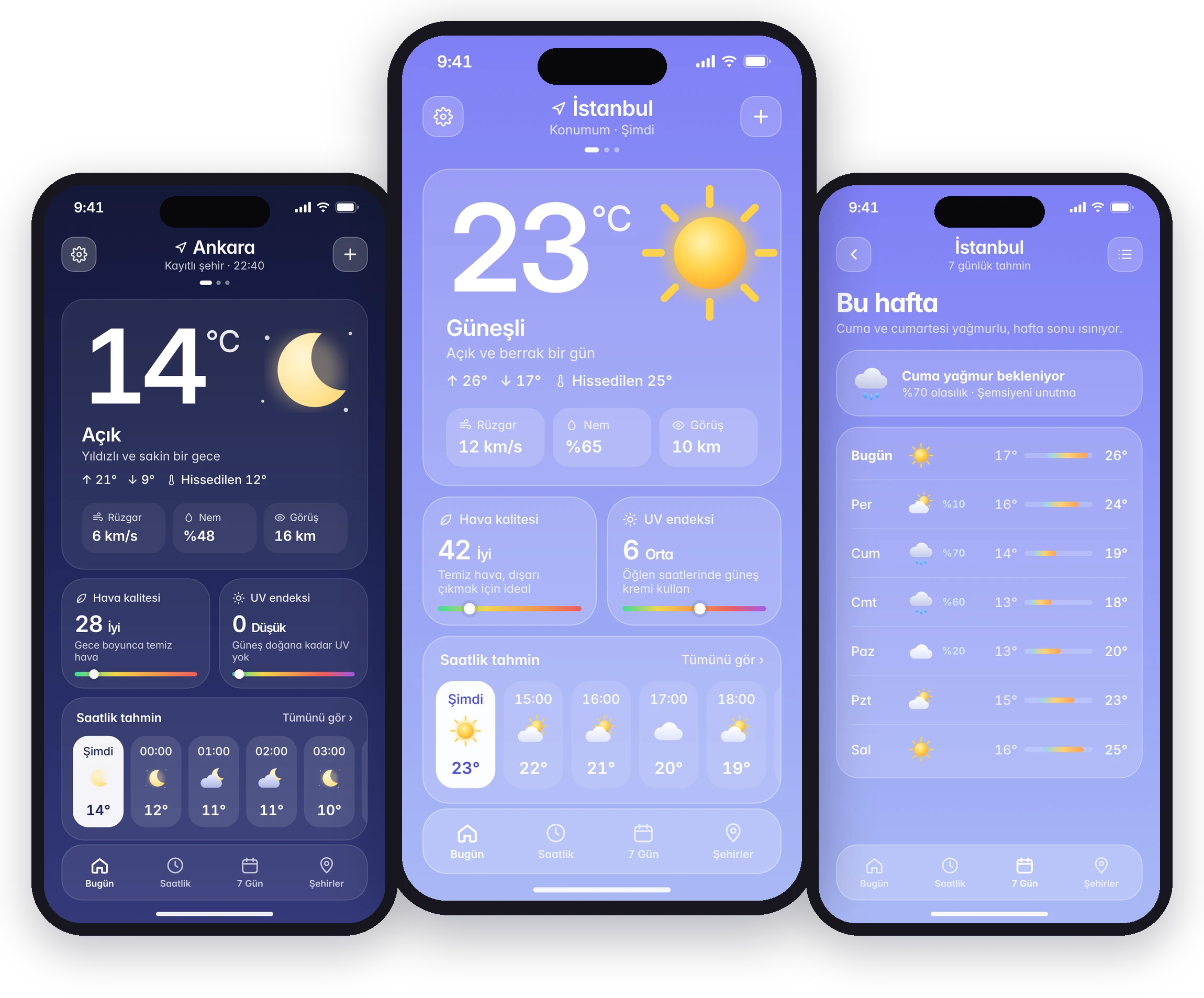
Popular weather apps have become crowded with ads, videos, maps and notifications, while the question most people have is simple: what's it like now, and later today? Weatherly answers that on a single screen. The current temperature, hourly and weekly forecasts, air quality and UV sit in a calm interface that changes with the sky.
Research
What people say about the weather apps they use
I ran a netnography study on App Store and Google Play reviews of popular weather apps, backed by user interviews.
What works
- Clean interfaces that are easy to understand
- Fast access to data and real-time updates
- Detailed, reliable hourly and weekly forecasts
What breaks
- Excessive ads and intrusive notifications
- Complex UI and too many features
- Inaccurate or outdated weather data
Persona
Designing for an analytical, on-the-go user

Deniz Karaca
Who they are
- Analytical: pays close attention to logic, flow and performance
- Efficiency-oriented and UI-aware; notices small bugs quickly
- Travels for work and switches between cities often
Pain points
- Slow apps, especially with a weak connection on the subway
- Cluttered UI and too many steps to reach basic information
- Poor contrast in bright or dark environments
What they need
- Accurate, fast information for quick decisions
- Dark and light mode for comfort in any environment
- Quick city switching and an ad-free, lightweight app
User flow
One home screen, everything one step away
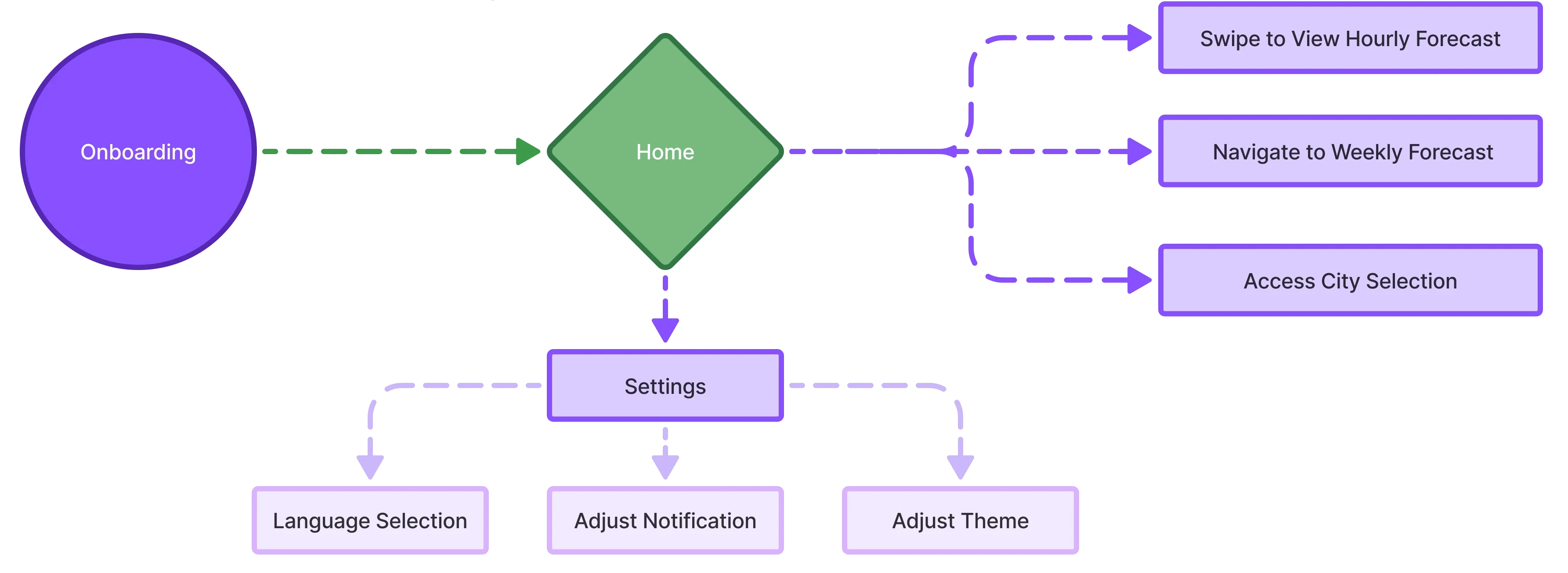
After onboarding, the home screen is the hub. Hourly and weekly forecasts and city selection are one swipe or tap away, and settings hold language, notifications and theme.
Benchmark
Five competitors, one gap
The leading apps compete on features: radar, video, alerts. Dark Sky was loved for its precise, clean forecasts, and Yahoo Weather for its visuals. Weatherly takes that simplicity and pairs it with an ad-free, lightweight experience.
| App | Platform | Known for |
|---|---|---|
| AccuWeather | iOS & Android | Detailed hourly and daily forecasts, radar maps |
| The Weather Channel | iOS & Android | Live weather videos, advanced notifications |
| WeatherBug | iOS & Android | Lightning alerts, air quality index |
| Dark Sky | iOS | Precise hourly forecasts, a fast and clean interface |
| Yahoo Weather | iOS & Android | Visually rich design with background photos |
| Weatherly | iOS | Everything on one screen, ad-free, adapts to the sky |
Design system
A soft palette that follows the sky
Each weather condition has its own background gradient, and frosted-glass cards keep text readable on all of them. The type scale uses Inter, with a large display weight for the temperature.
Wireframes
From a first draft to the full flow
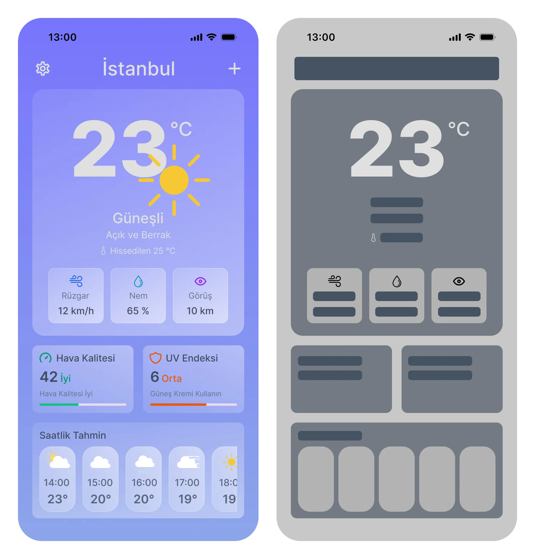
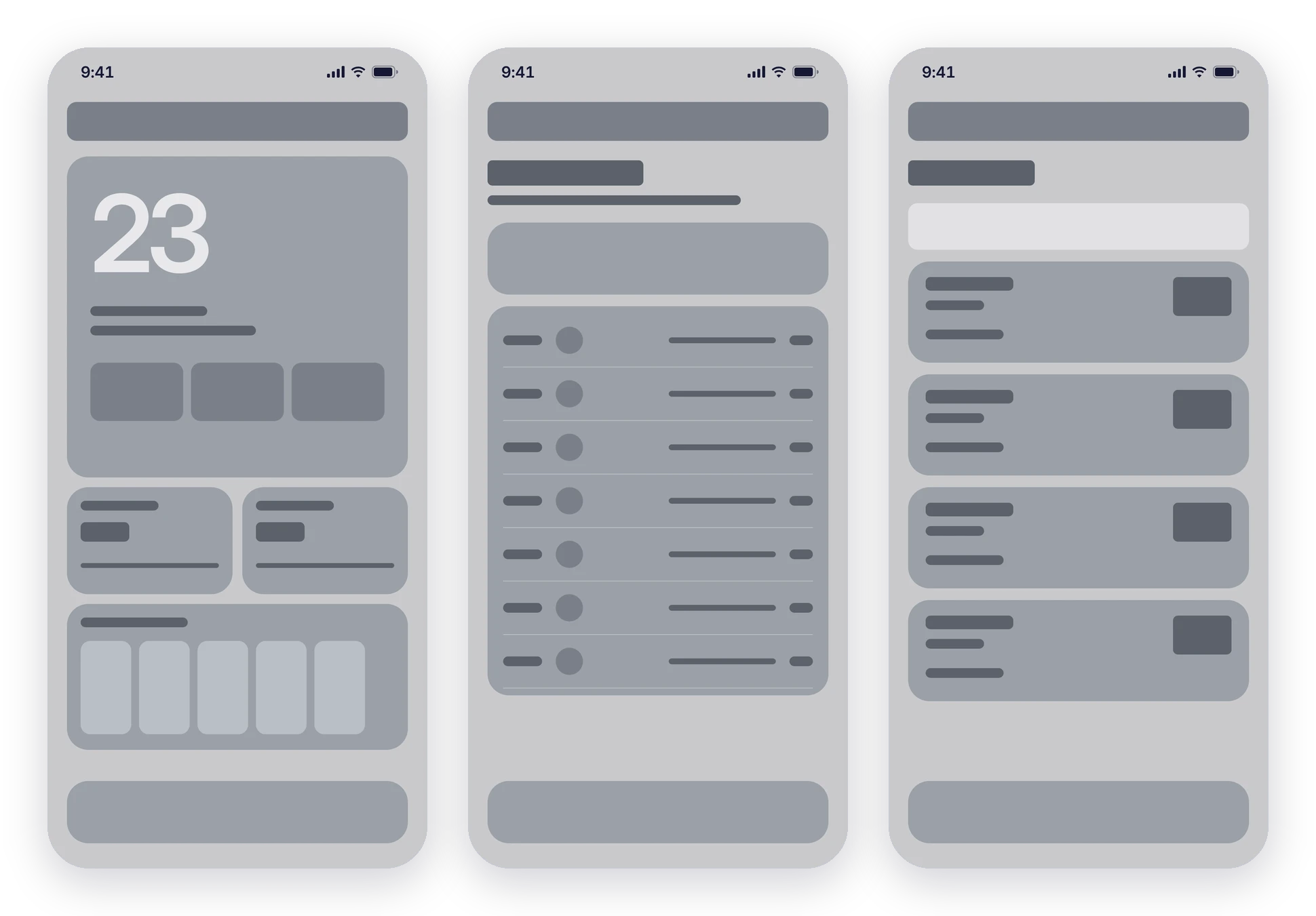
The first iteration set the home screen: a large temperature, three key metrics, air quality and UV, and an hourly strip. I then took that structure across the weekly forecast and city screens.
Final UI
The finished experience
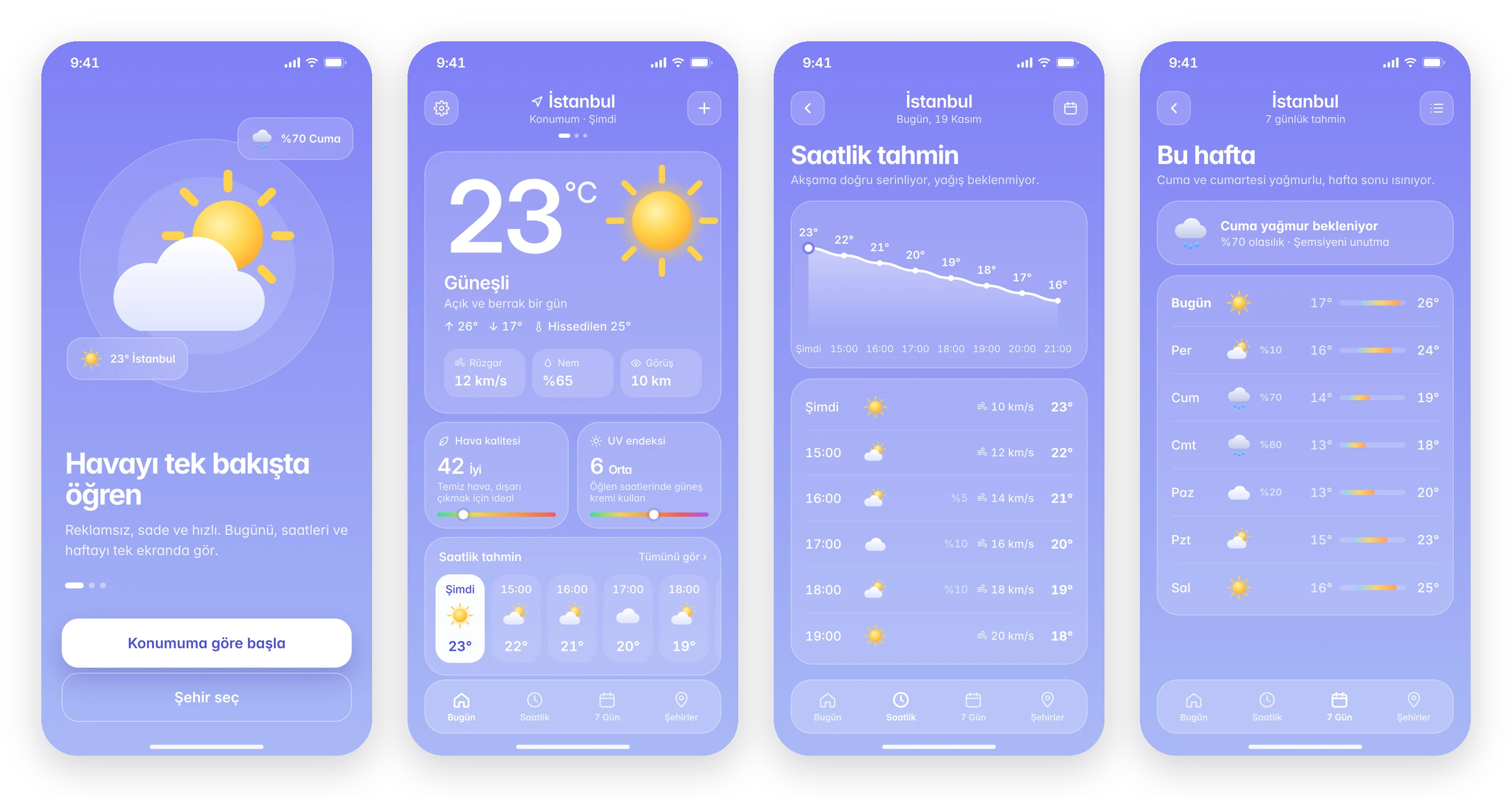
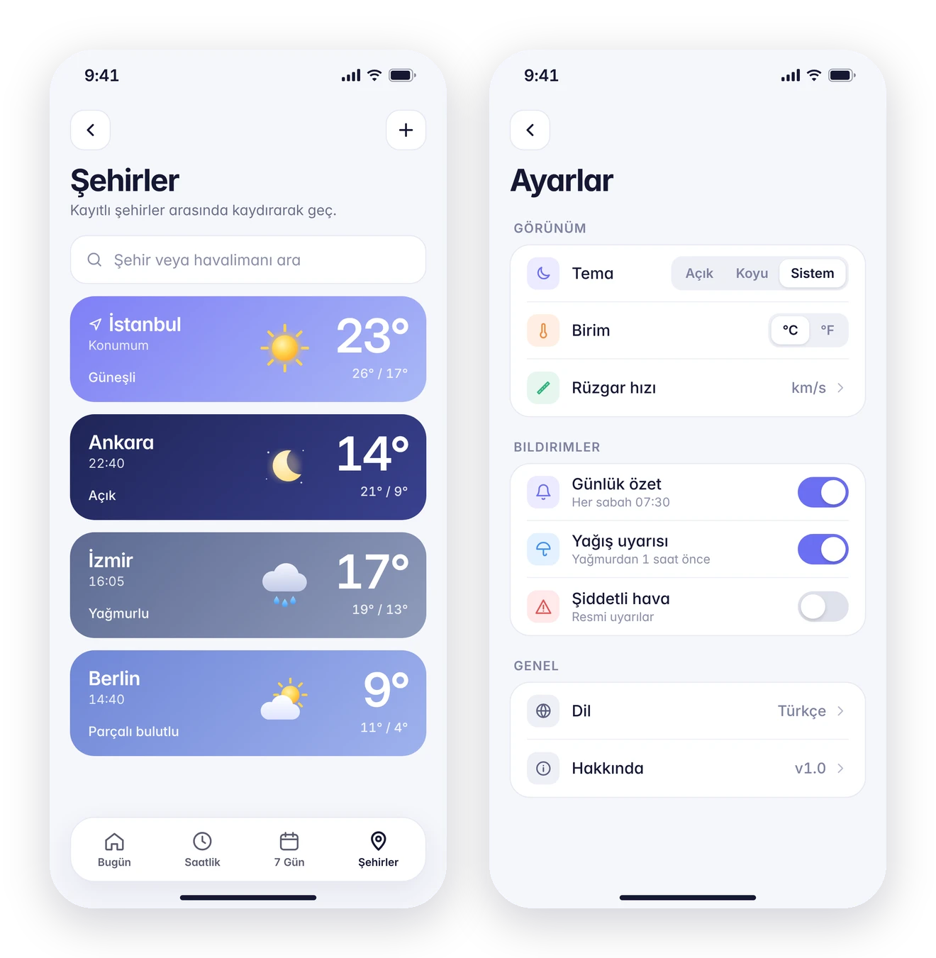
Onboarding asks for one thing: location. The home screen answers "what's it like now?" at a glance; hourly and weekly views add detail with a temperature curve and range bars. Cities are visual cards, and settings stay short: theme, units, three notifications and language.
Weather states
The interface changes with the sky
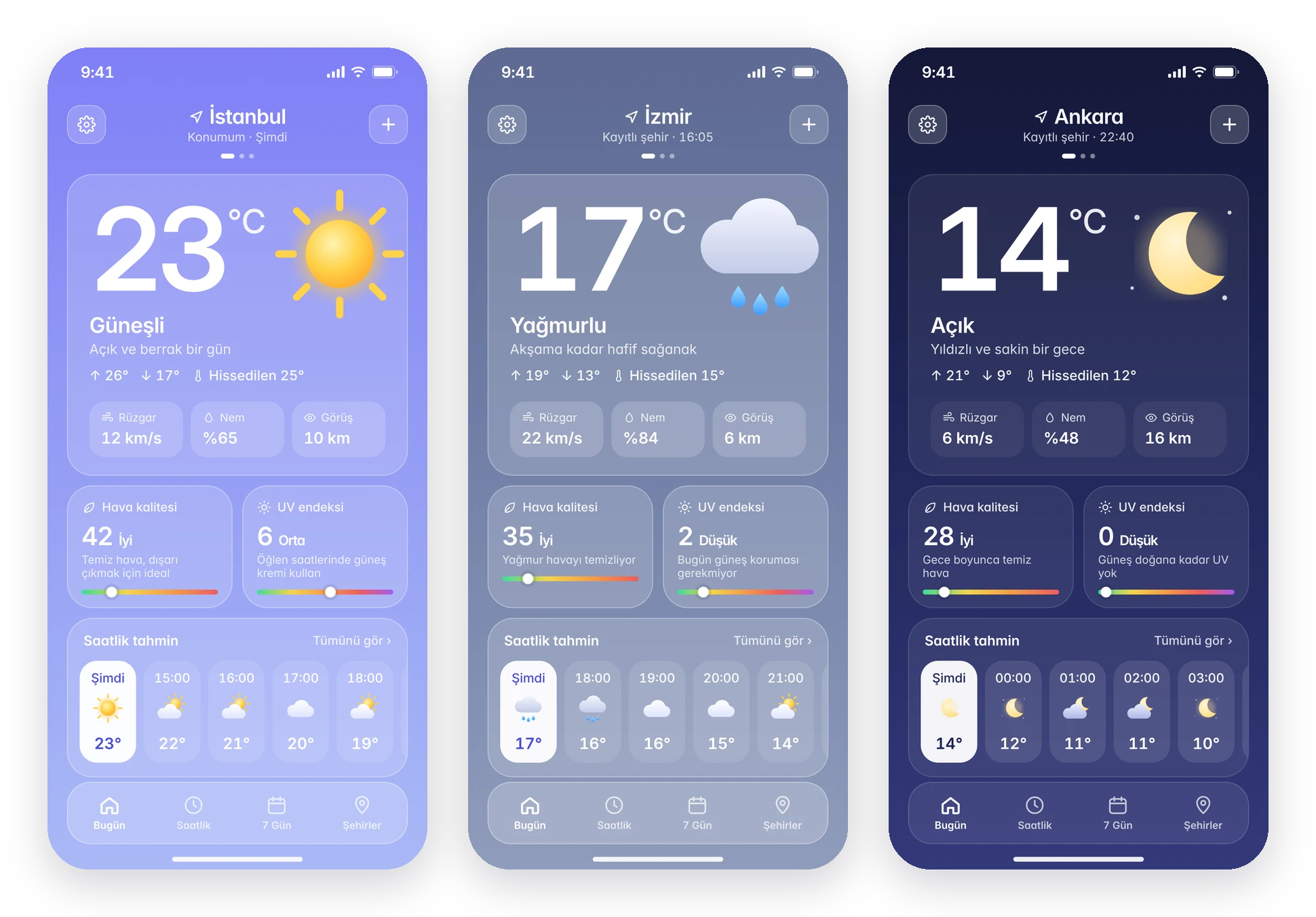
Backgrounds, icons and tips follow the current conditions. Sunny days are bright periwinkle, rain turns slate grey with an umbrella reminder, and night switches to deep navy, which also works as the dark theme.